About the Project
Salish Soils Narrative Identity Design
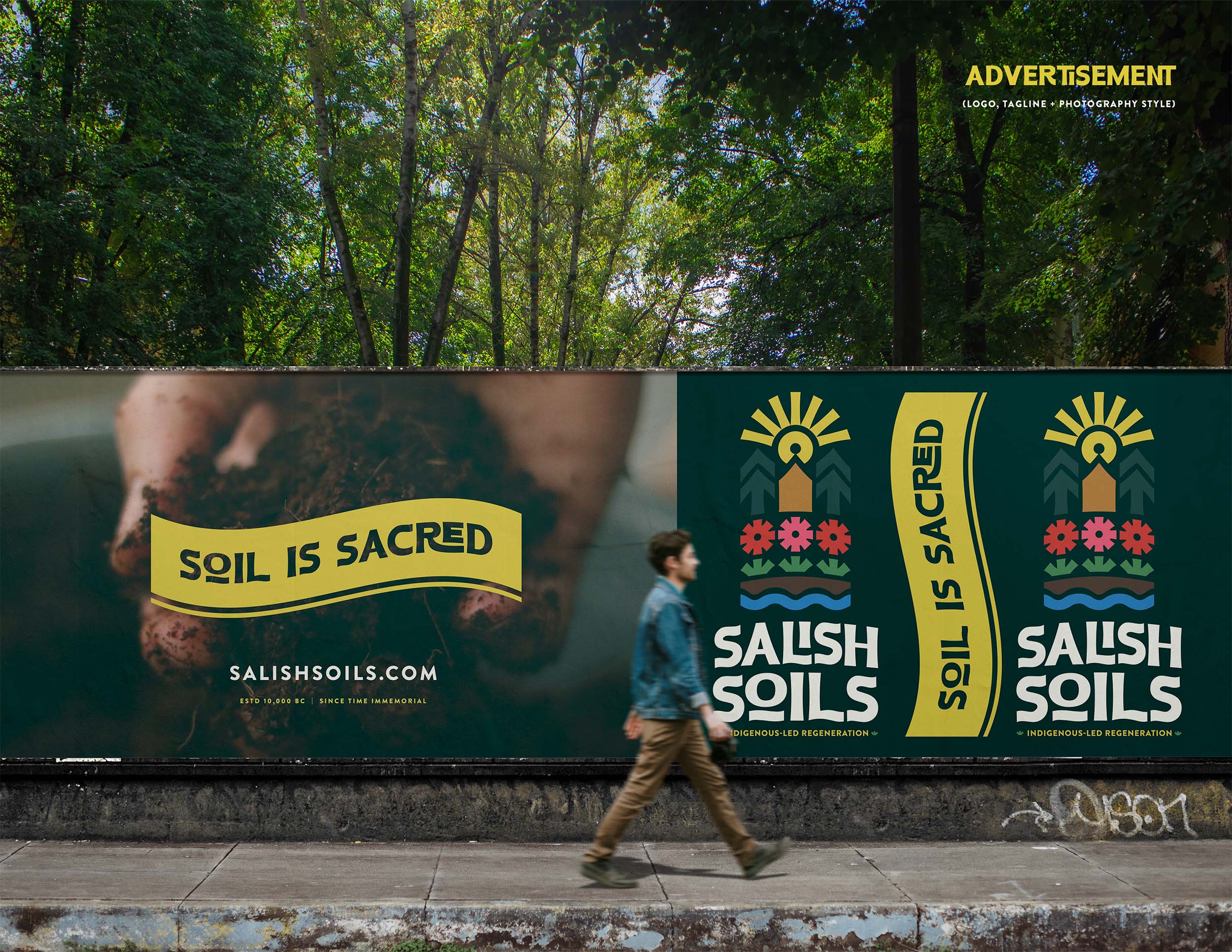
Behind the Salish Soils global brand is a simple philosophy: soil is sacred. Through storytelling, the brand transforms how we look at resources, waste, and Indigenous-led sustainability: exploring the interconnectedness of all things, and developing a deeper understanding of and respect for traditional and modern resource and waste management.
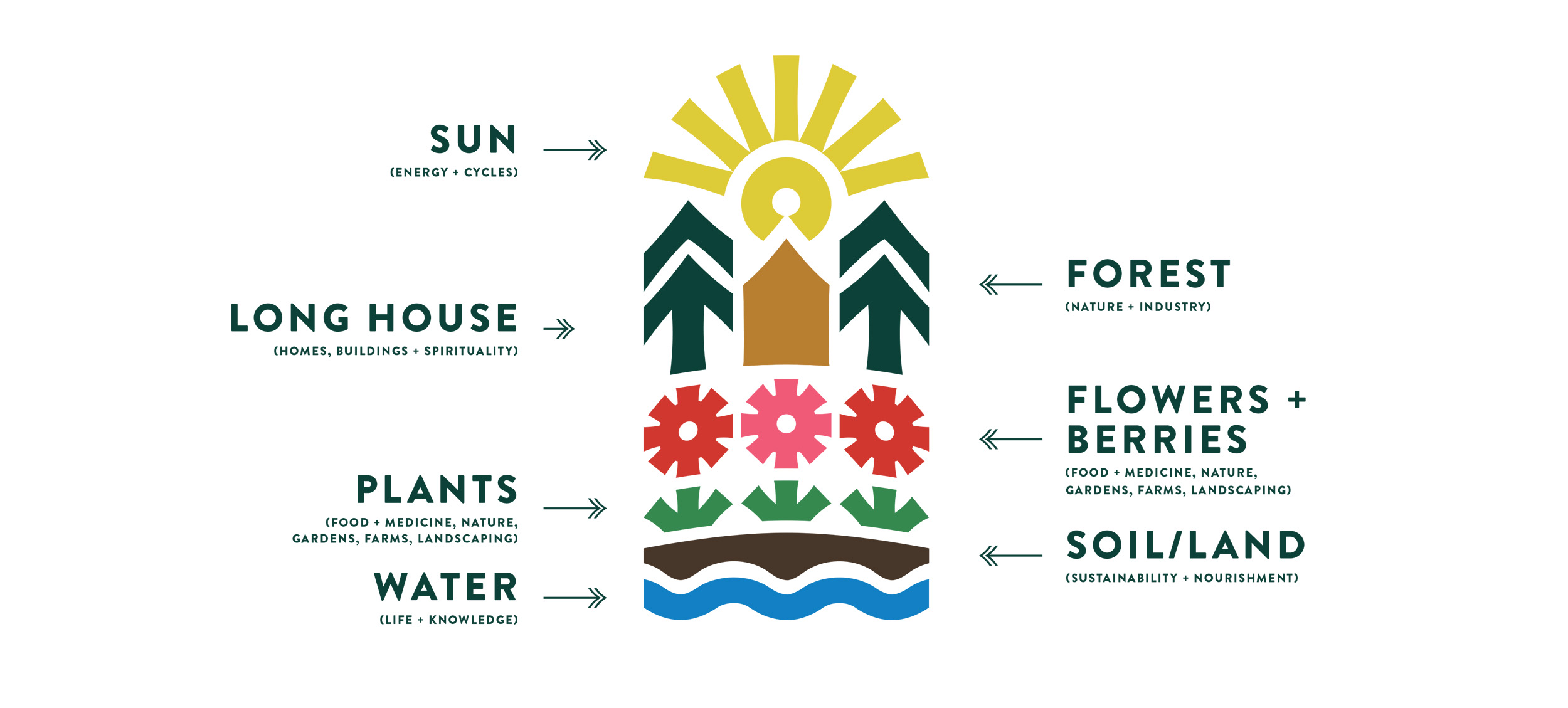
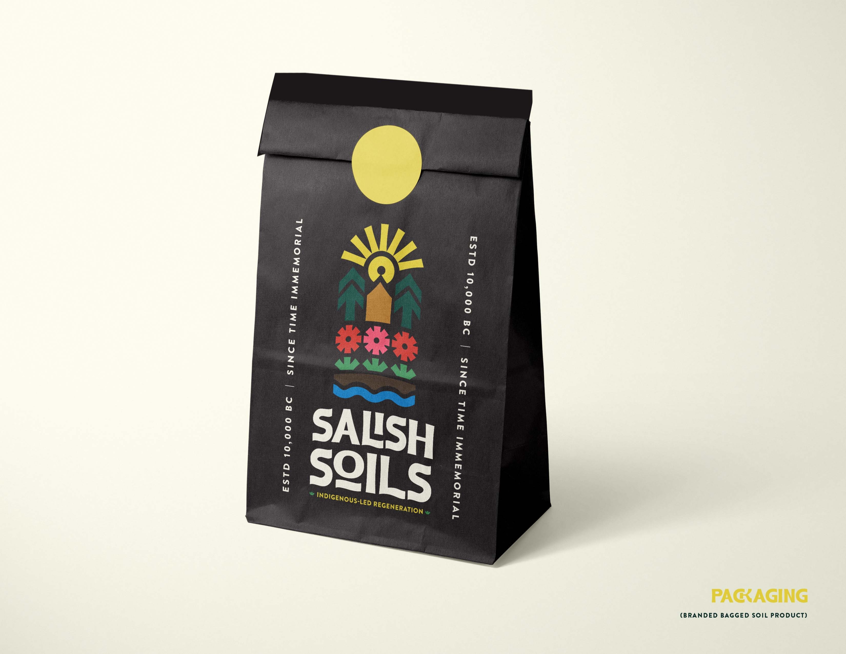
The brand is an inclusive evolution rooted in ancestral Coast Salish cultural values and artistry—reaching upwards and outwards for global impact. Inspired by the symmetry and geometry of traditional Coast Salish carving and weaving, the logo depicts the cyclical and reciprocal relationships between all of its elements: sun, water, plant kin, people, and soil.
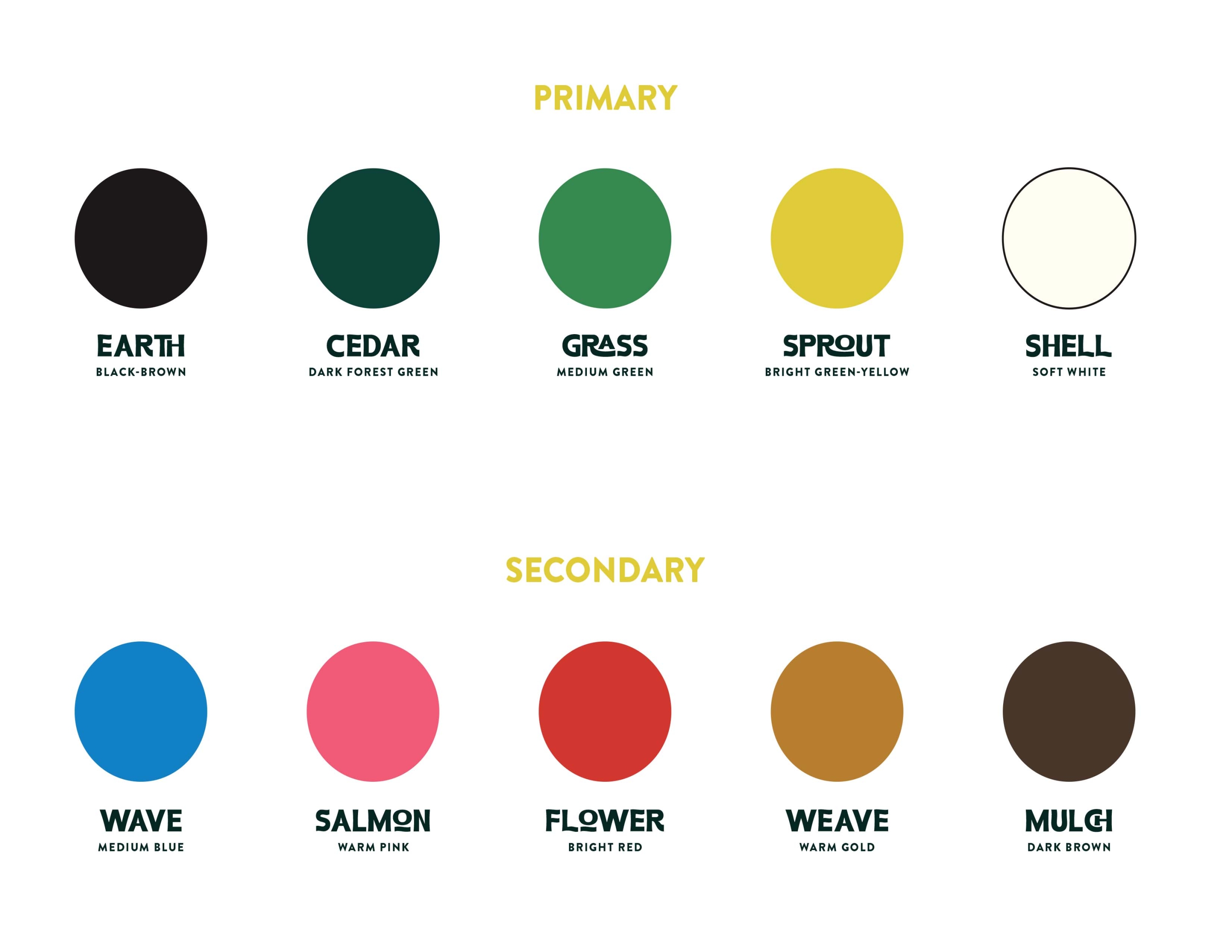
The primary font chosen for the brand is full of energy and movement. Reminiscent of the previous brand type, it creates a connection to the past, honouring the path that’s led Salish Soils to this point. To give it flexibility in terms of brand personality, we’ve paired it with a clean and classic sans serif font. A monochromatic primary colour palette, and an extended secondary palette bring in the colours of the coast: water, trees, plants, berries, flowers, and soil. These palettes allow the company to make minor adaptations according to a specific product, service, or department. Overall, the global brand was designed for staying power, brand cohesion, and brand recognition across the diverse range SEG offers.
Bold, stylish, interconnected, and joyful—the Salish Soils brand embodies the colours, spirit, and lay of the land.