About the Project
Métis Thinkers Network: Narrative Identity Design + Website Design + Development
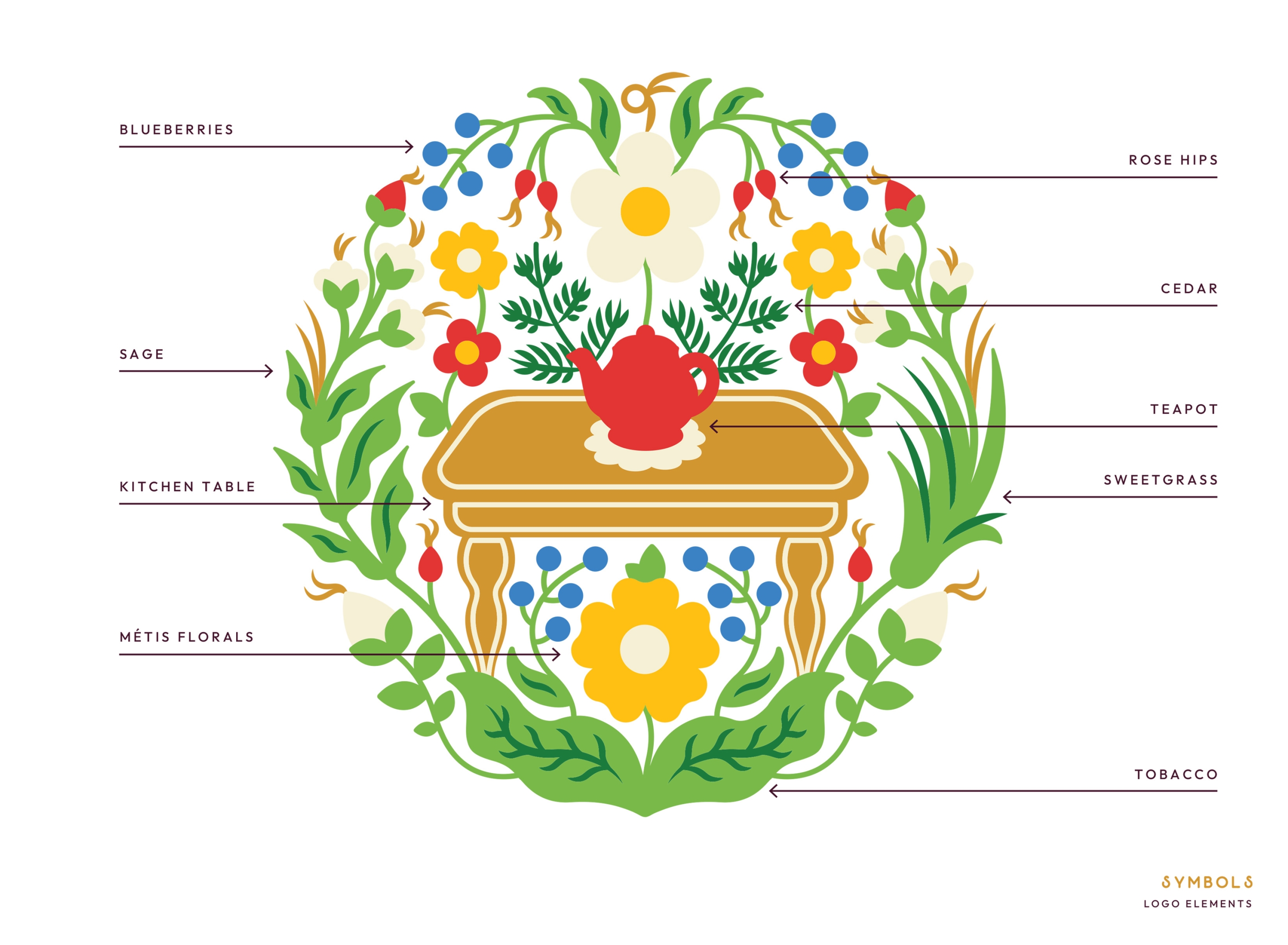
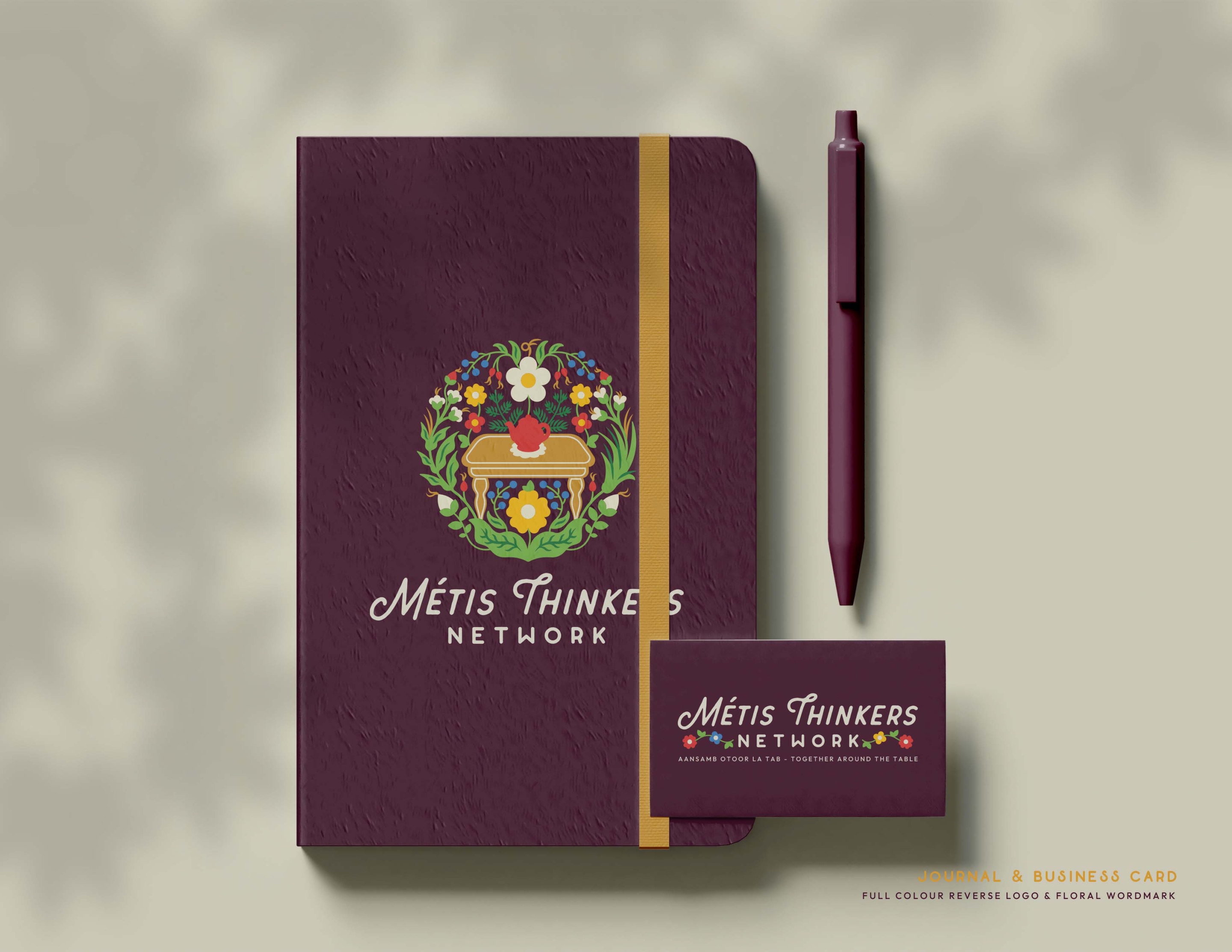
Traditional Métis florals and the four sacred medicines (tobacco, sweetgrass, sage, and cedar) are gathered around the kitchen table, with a teapot at the centre. Some are visiting, some are rocking, some are working, some are playing, some are holding space for the magic that is unfolding. Their shapes and colours come together in a joyful and vibrant way. Each one’s distinctive beauty is enriched by the presence and connection of the others.
Evoking an overall sense of home, kinship, and belonging, these diverse plant kin represent how, through the generations, our unique roles and gifts collectively contribute to not only our survival, but to our flourishing.
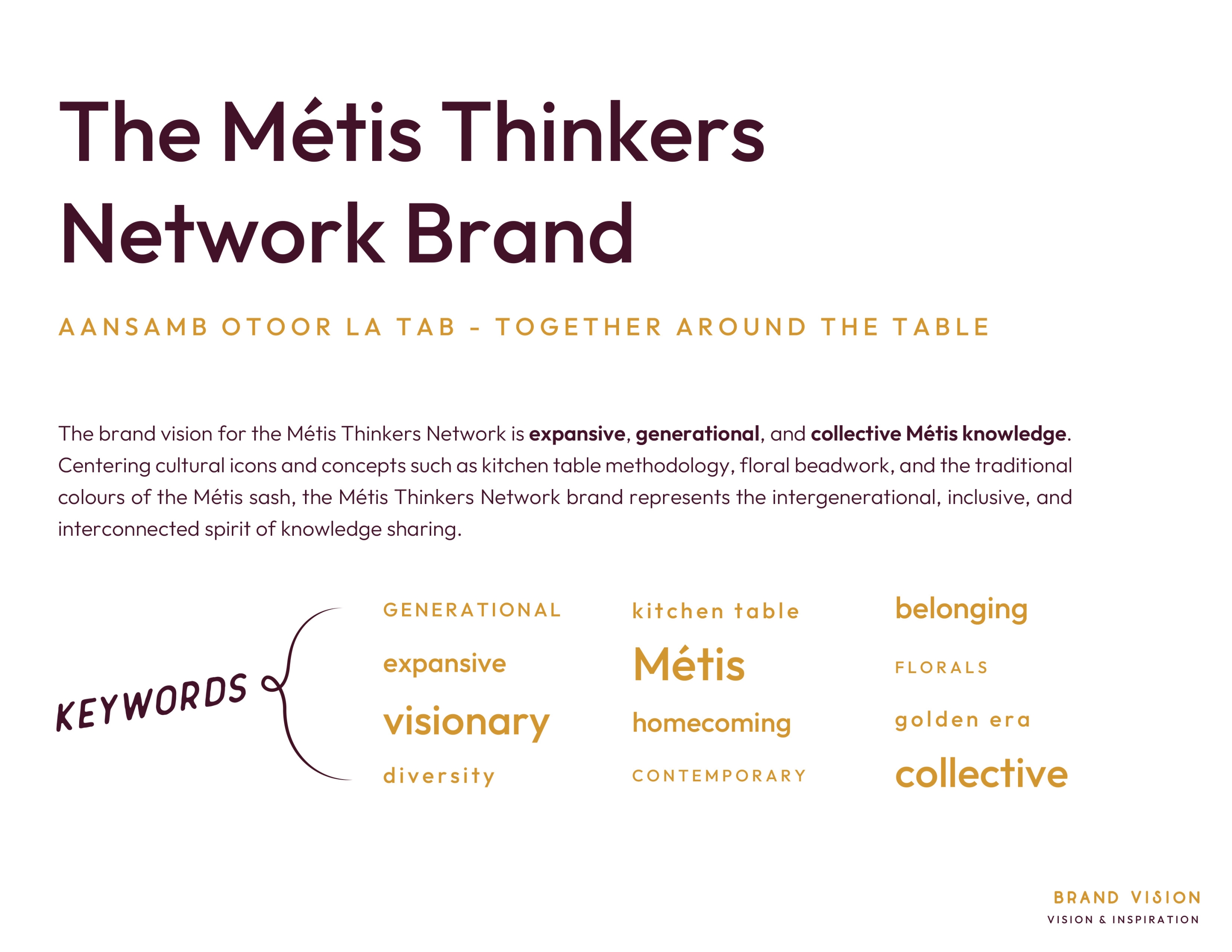
From the design elements to the typography to the colour palette, the brand balances an overall contemporary style with a nod to the historical golden age of the Métis. The beaded florals of our Grandmother pieces, our sacred medicines, and the kitchen table are depicted in a contemporary “flat” illustration style.
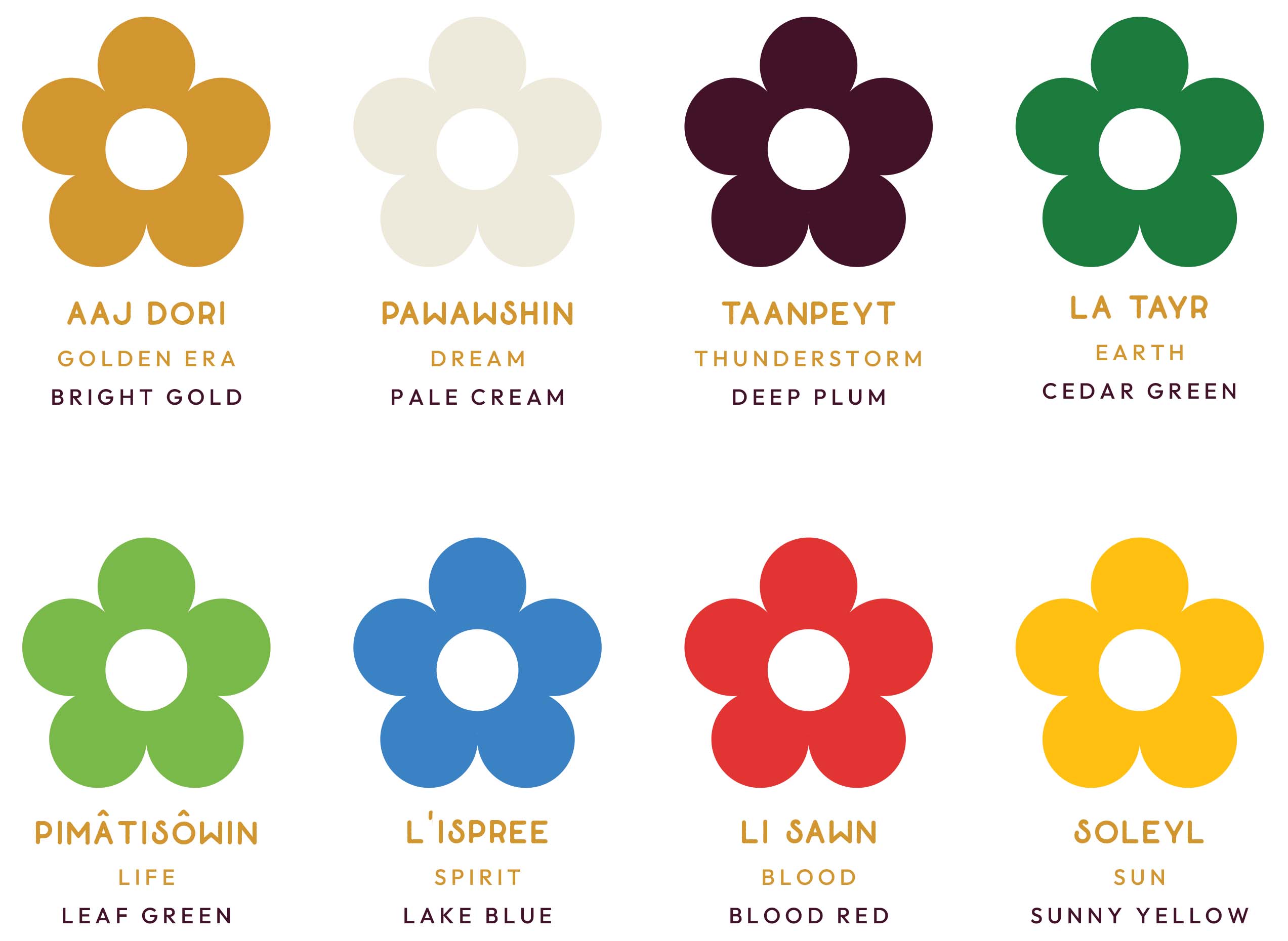
The brand palette is warm, bold and rich—expanding on the traditional colours of the ceinture fléchée of red, blue, green, yellow, and white with a cedar green, and deep plum. Finally, the typography calls to mind the inky type of transformative documents created not only by the celebrated leaders of our past, but by the modern Métis thinkers who lead our resurgence.